Designing a Logo to be More Inclusive
The New Haven Health Department (NHV Health) reached out wanting a logo that would better represent the community they serve and their new strategy for equitable health. This project was a great example of a logo that is inclusive and community-based.
Discussions about demographics, health equity, and community, led to a logo NHV Health was excited to reveal to its staff and the community.
Demographics
New Haven has a diverse population. It is 40% white, 34% Black or African American, 13% Other, 7% bi-racial, and 5% Asian. 30% of the population is Hispanic. More than 60 languages are represented. 35% of people speak a language other than English, 23% of which speak Spanish. 21% of people have not obtained citizenship.
With all this to consider, the top things to keep in mind for the logo design were:
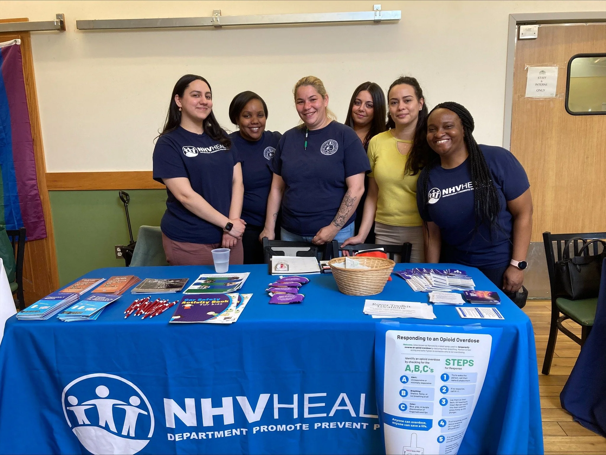
Be inclusive of race. My original design used negative space to create the three human figures. The downside to this was that when the logo is placed on a white background, the figures were therefore all white. I ended up reversing the positive and negative space to make the figures blue. This provided the ambiguity we were looking for.
Be inclusive of culture. Any visuals in the logo need to be easily recognized across cultures. After playing around with different visual representations of health and wellness, we found that the human figure was the most universal
Be inclusive of all languages. The name and tagline are in English, so whatever visuals we chose would play a role in communicating with those who can’t read English. For example, we ended up eliminating the use of medical symbolism because NHV Health did not want to be mistaken for a healthcare provider.
Health Equity
Health inequities can be attributed to many things: education, income, access to healthcare, nutrition, and healthy homes, and discrimination within healthcare settings. These inequities often result in poor health and preventable deaths, especially for Black and African-American people.
NHV Health makes advocating for health equity a priority, ensuring the health and well-being of ALL its residents. They requested that their vision for health equity be incorporated into the logo design.

We gained design inspiration from a cartoon that captures the meaning of health equity well. You may have seen it before since it became a highly shared image during COVID-19 when health disparities were prominent. Even though each of our figures is a different height, they all stand at the same shoulder height, linking arms. This is because we’ve not placed them on an equal playing field (ground), but an equitable one.
Community
It’s important to note that this rebrand happened during the COVID-19 pandemic. The lack of knowledge about the new virus created a level of mistrust between communities and government entities providing health guidance. NHV Health hoped that this rebrand would help to improve their relationship with the community so that they could be seen as a trusted partner.
For this reason, we incorporated multiple figures into the logo. The linked arms and the circle that contains the figures provides a sense of safety, togetherness, and belonging. They also requested that the elm leaf be included since New Haven is known as Elm City. This informed the shape of the ground.

The community reacted positively to the new logo and most people would agree that the new logo is more inclusive and better represents the New Haven community.


Need help designing a new logo?
I promise to put just as much thought into your new logo.