Get Inspired by Pantone's Controversial Color of the Year
Every December since 1999 Pantone reveals its color of the year. This year marks the 25th year and they have chosen a color that is far more controversial than last year’s magenta.
PANTONE 13-1023 Peach Fuzz

Before I dive into what people are saying about Peach Fuzz, here is how Pantone has presented their color choice:
“As we navigate the present and build toward a new world, we are reevaluating what is important. Reframing how we want to live, we are expressing ourselves with greater intentionality and consideration. Recalibrating our priorities to align with our internal values, we are focusing on health and wellbeing, both mental and physical, and cherishing what’s special — the warmth and comfort of spending time with friends and family, or simply taking a moment of time to ourselves.”
“PANTONE 13-1023 Peach Fuzz captures our desire to nurture ourselves and others. It's a velvety gentle peach tone whose all-embracing spirit enriches mind, body, and soul.”
Why all the hate?
Here are some of the controversial opinions from the comment section of their announcement post on Instagram:
“The uncooked chicken breast colour.”
“This is the color you pick when you don’t know what color to pick”
“After 4 years of coral? Seems a bit repetitive.”
“This one is so boring and gives me 2010’s vibes 😭” referring back to 2016’s color of the year, Rose Quartz, also known as millennial pink.
“This color does not look good on anyone.”
On a more serious note, here is the real backlash on Peach Fuzz:
Did Pantone not learn anything from 2019 when they released PANTONE 16-1546 Living Coral? Environmental activists found Living Coral a highly irresponsible choice as it was released the same year coral reefs began rapidly dying. It was a missed opportunity to make a statement.
There was lots of talk about how Pantone is allegedly making a political statement by choosing a white skin tone as their color of the year. Many people compared the color to that one skin-toned crayon.
Pantone is feeding into the beige girl aesthetic. Many people are over beige and want color. It’s the same backlash Behr received when it released its 2024 Color of the Year, Cracked Pepper.
Lastly, there was plenty of controversy over Pantone’s use of AI-generated images and video in their promotion of the 2024 Color of the Year. People thought that a design-based organization such as Pantone, should hire “real artists”.
While I think a lot of people are valid in their negative responses to this color, I think Peach Fuzz has more creative potential than it is given credit for.
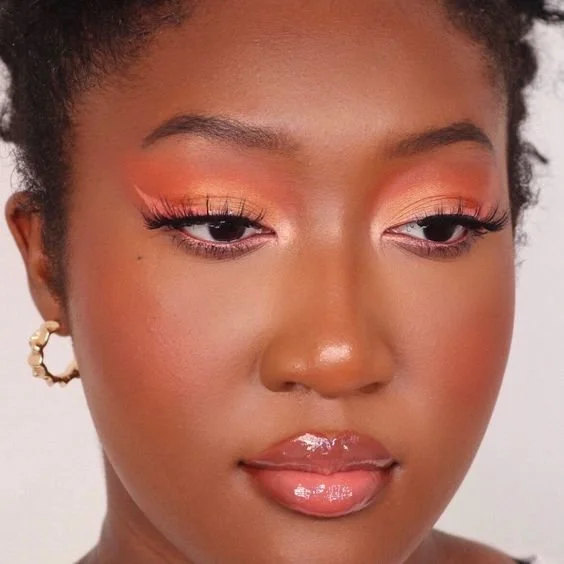
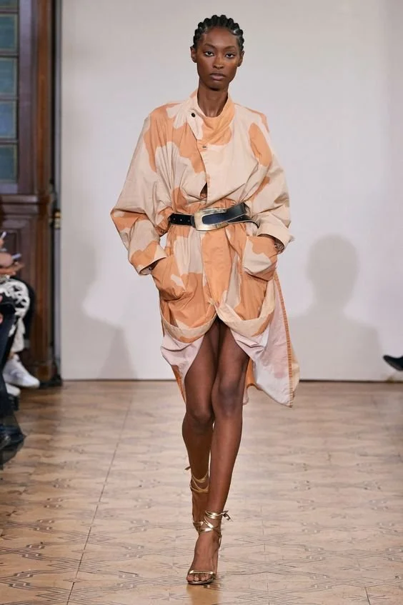
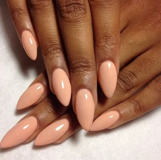
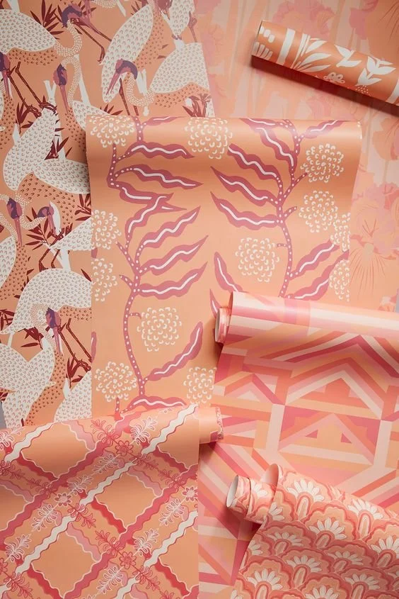
Color Schemes
I’ll admit that Peach Fuzz does not give a great first impression, but when you start to look at its color schemes, it may grow on you. Here are just a few of the color schemes Pantone created.
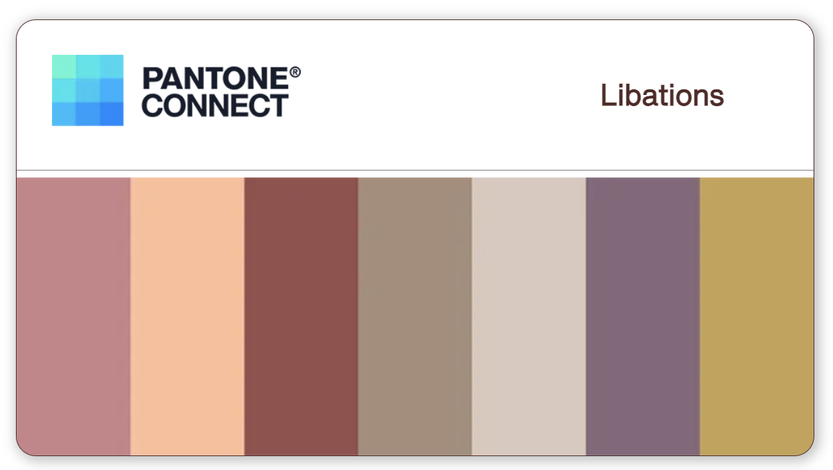


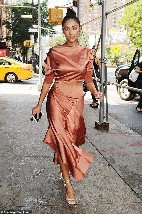
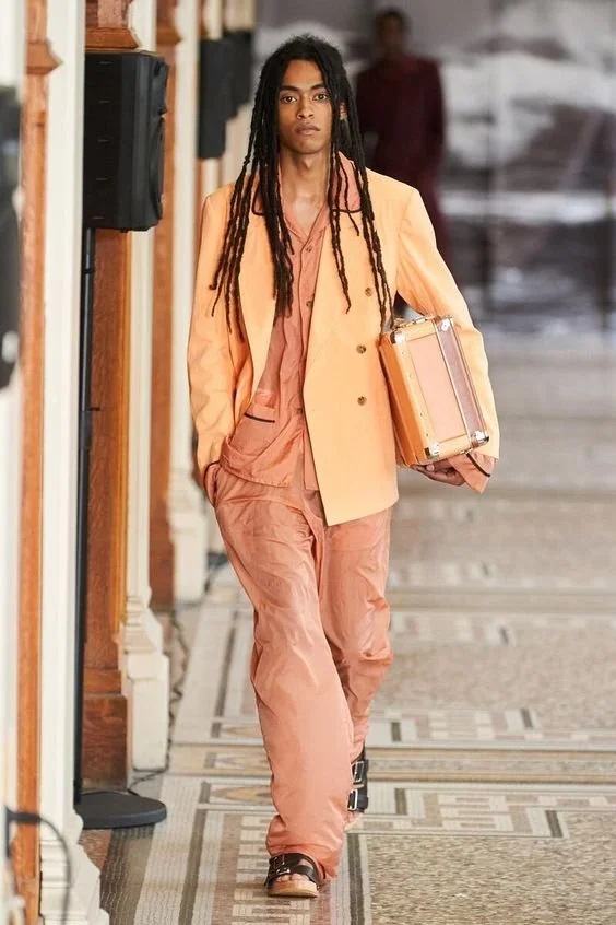
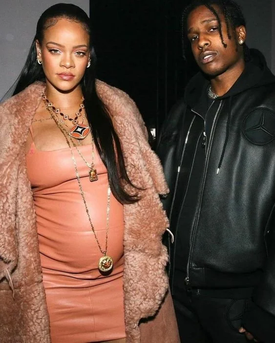
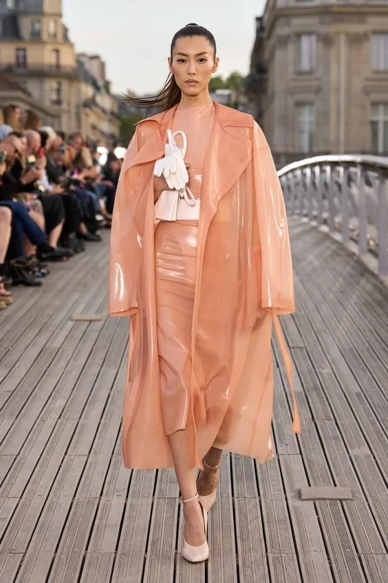
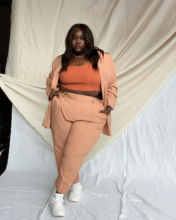
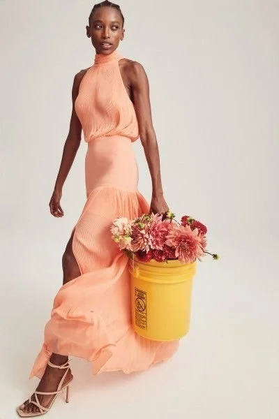
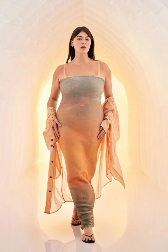
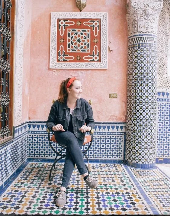
Fashion & Beauty
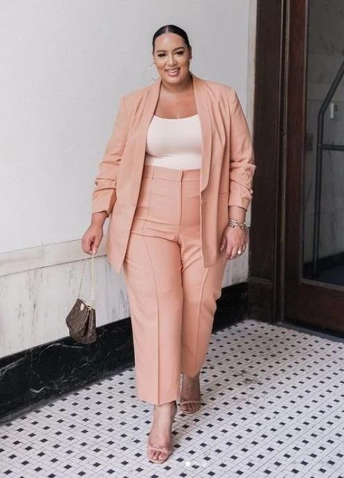
While I understand that Peach Fuzz is inherently a white person’s skin tone, it is also true that it looks equally as bad on every skin tone (lol). Just kidding! I actually think that Peach Fuzz can be flattering for many people. Here is some inspiration for anyone who thinks they can’t pull it off:

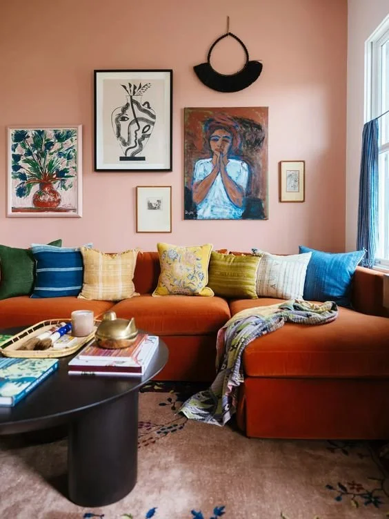
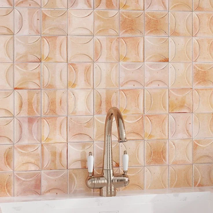
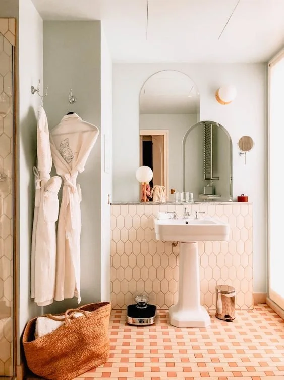
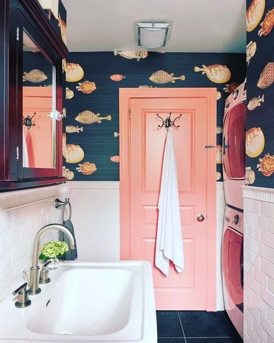
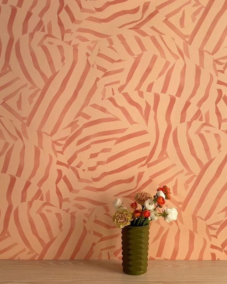
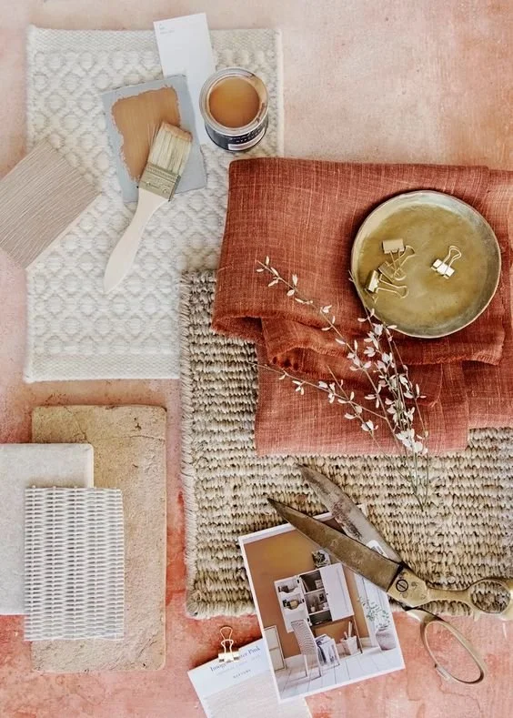
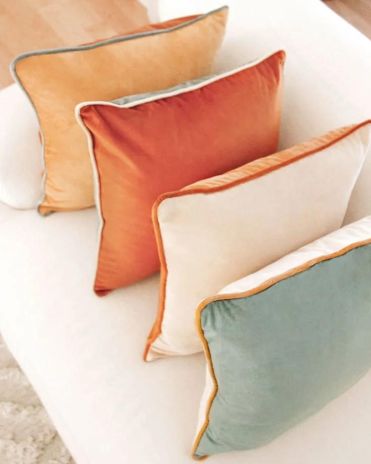
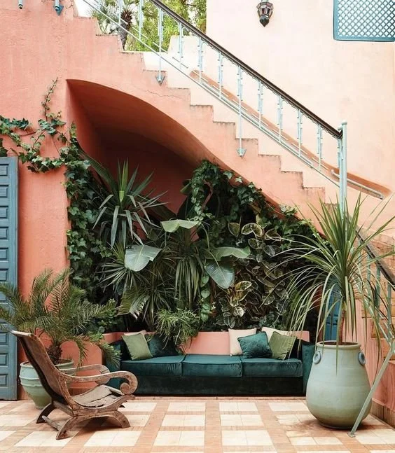
Interior & Exterior Design
I think where Peach Fuzz falls short is in the interior/exterior design world. It’s a bit more challenging to create a space that isn’t boring and beige. Here’s some inspiration where I think the Color of the Year works well. And look! It pairs well with everyone’s true favorite color right now, green:
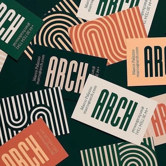
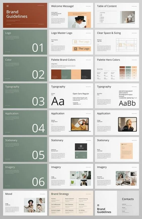
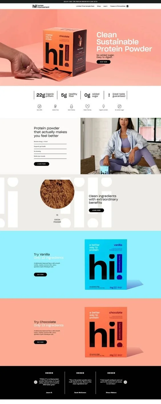
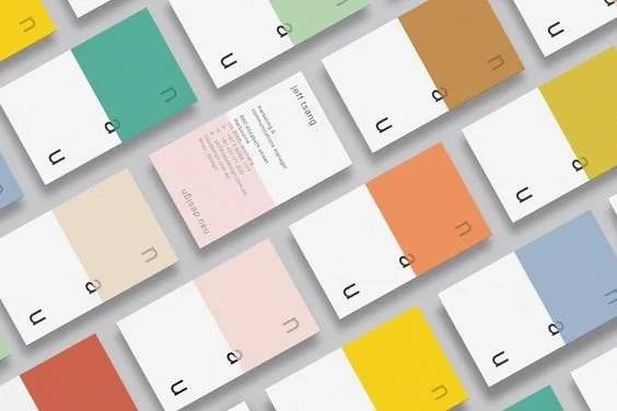
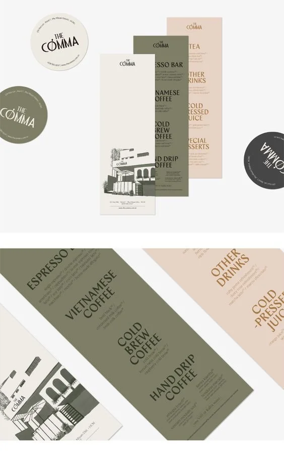
Graphic Design & Marketing
Let’s talk about peach fuzz in the graphic design and marketing space, because that is where I work after all. While Peach Fuzz may be a win for more “feminine” industries, how do we incorporate it in other spaces? Pair it with rich colors.


As someone who prioritizes purposeful design, I think Pantone has yet again missed an opportunity to make a larger statement about the current state of the world.
I may not be able to remove any of the negative associations of Peach Fuzz, but I hope I’ve inspired you to at least explore how you may want to incorporate it into your life, matching your personal values and aesthetic.